The very first question comes in mind is
Should I use Power BI Desktop or Power BI Service to create a dashboard ?
You should get started with Power BI Desktop. As I have already told in the first blog (Blog 1) that the flow of creating a report is Power BI Desktop > Power BI Service > Power BI Mobile
Get Started with Power BI Desktop
If you are opening Power BI Desktop in your system then the first screen will be look like this
This window is divided into 3 parts
- Data and Files
- Sign in
- Tutorials & Blog
The first section will display recent files and dashboards. But first time it will be blank.
In the second section, you will find two options. If you have a Power BI account then Go for Sign In (Not mandatory at all) else click on Try Free
In the third section, You can follow latest updates and tutorials.
After Sign In, you will see this type of windows called Power BI Desktop Window
So this window is mainly divided into 7 parts
- Ribbon - Displays common tasks that are associated with reports and visualizations.
- Fields Pane - Displays the tables, folders, and fields in your data that are available for you to use to create visualizations.
- Visualizations Pane - Where you can change visualizations, customize colors or axes, apply filters, drag fields, and more.
- Filter Pane - Where you can apply filters
- Report View or Canvas - Where visualizations are created and arranged.
- Report, Data, and Model views- You can switch between Report, Data, and Model views by selecting the icons in the left column.
- Pages tab - Located along the bottom of the page, this area is where you would select or add a report page.
Connect to Data
To make a report, we should have a dataset with us. To import the data into Power BI desktop, you will find the option Get Data in the Ribbon.Now you can connect data from your computer or any database which is available in the data sources list. In Power BI Desktop, you will find separate option for both excel and CSV file.
I will use Financial Sample Dataset. You can download it in excel format Financial Sample
Now choose Get Data > Excel
After that, you will see the Navigation window.
The Navigator window displays the tables of your data source, and selecting a table gives you a preview of its contents. You can then import your selected tables by selecting Load, or you can select Transform Data to transform and clean your data before importing.
Later we will be discussing the whole procedure of ETL (Extract, Transform and load ) in the next blog.
Tip : Before importing the dataset, you should first see the raw data and try to understand the basic structure and format of dataset. This will help you out while data cleaning or report creation.
Note : You can also transform the data after importing or Load. Similarly you can load data after transformed data.
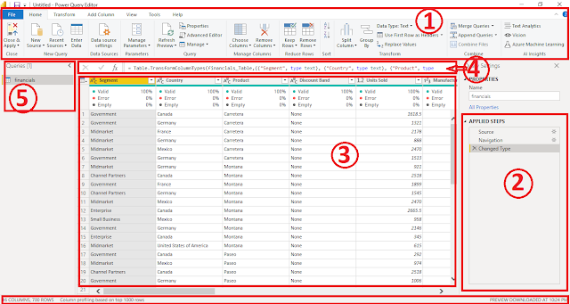
Whenever you transform the data, new window will open called Power Query Editor.
In Power Query Editor, you'll find several functions and feature to clean and transform data.
- Ribbon :- You will find several options there for date type, delete or add a new row/column etc.
- Applied Step Pane :- You will find all the applied steps by you while working on Power Query Editor.
- Table Viewer :- You can see the data into tabular format. Here you can also do column operations
- Formula Bar :- Here you can write formula for calculation, DAX functions, etc.
- Query Pane :- Queries/tables are listed and available for selection, viewing, and shaping.
When the transform or cleaning part is done, click on Close & Apply button at the left most side of the ribbon. Now you will find data/ columns in Field Pane. Finally, you are ready to create a report just by drag and drop the columns into Visualization Pane or Report Pane.
Lets see the first visualization, Sales by Year . There are 2 ways to create a graph.
- Drag & drop the columns in Report Pane.
- First choose what type of graph you are looking for and then drag and drop the columns from field pane to visualization pane.
Here, I drag and drop Sales column from field pane to report pane and then drag and drop the Date column into the graph.
You can change the color, title, labels, font color, etc. of a graph from Visualization section.
Congratulation !!!.... 😊
You have created the first visualization using power BI.
You can share your reviews and doubts. My comment section is always open for you.


Is power BI a free tool?
ReplyDeleteIts free until you don't want to publish your report else you can take free trial of Pro account for 60 days with your work mail.
DeleteTo create a account refer my last blog https://www.meticlux.com/2021/05/get-started-with-power-bi-desktop.html
Okay..thanks
DeleteWhat is power ib i don't know about it
ReplyDeletePower BI is an analytics and visualization tools. It is use to create reports/ visualizations with connecting different data sources. You can also refer my first blog on Power BI.
Deletehttps://www.meticlux.com/2021/05/introduction-to-power-bi.html